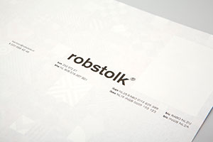


Robstolk, 2014
new stationery for Dutch printer Robstolk
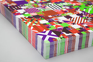
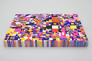
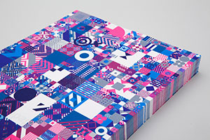
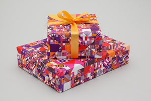
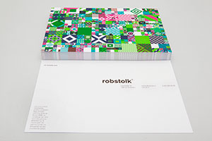
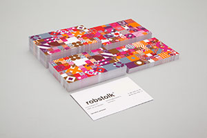
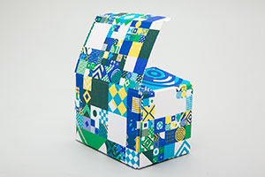
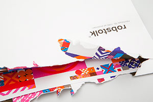
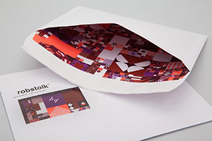
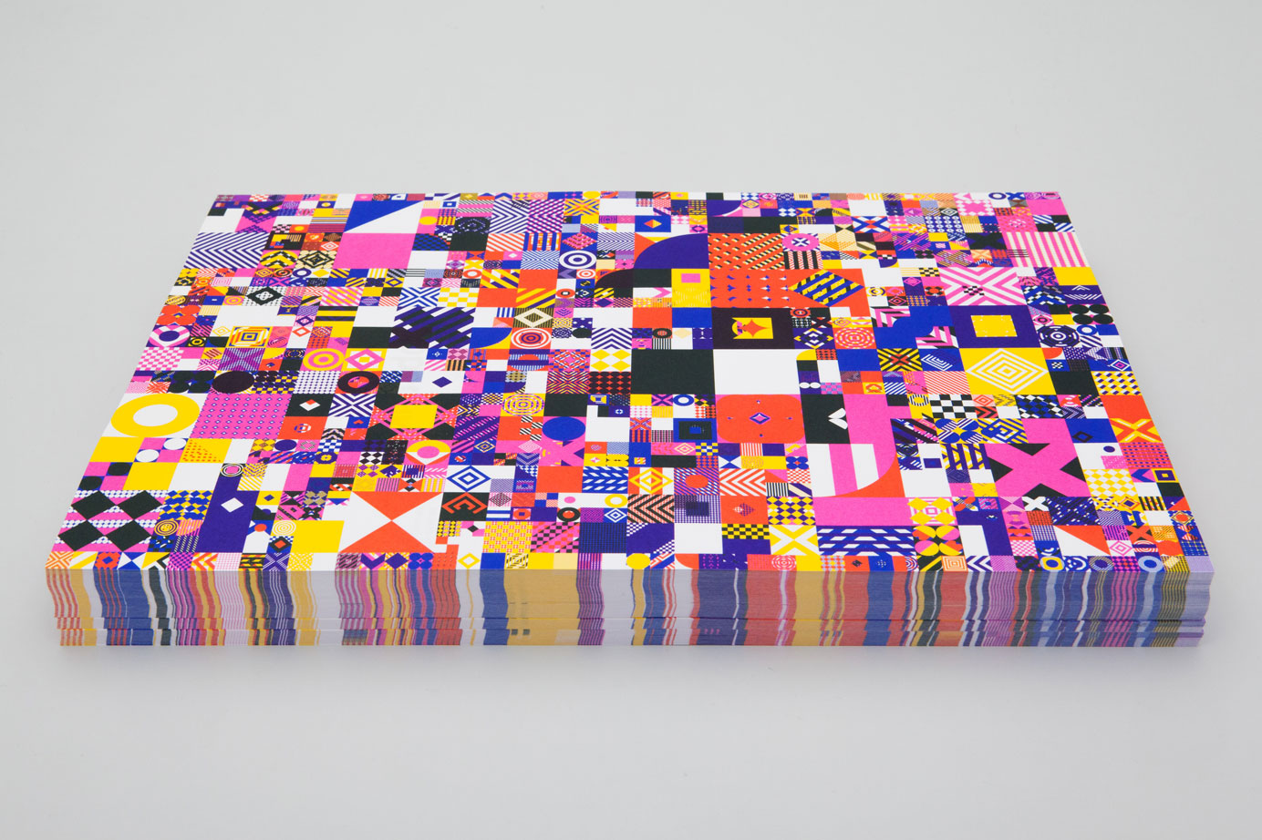
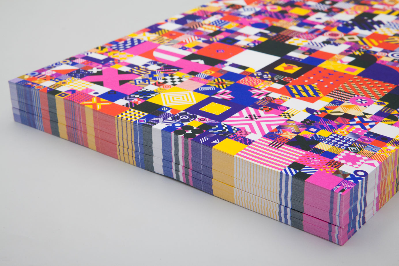
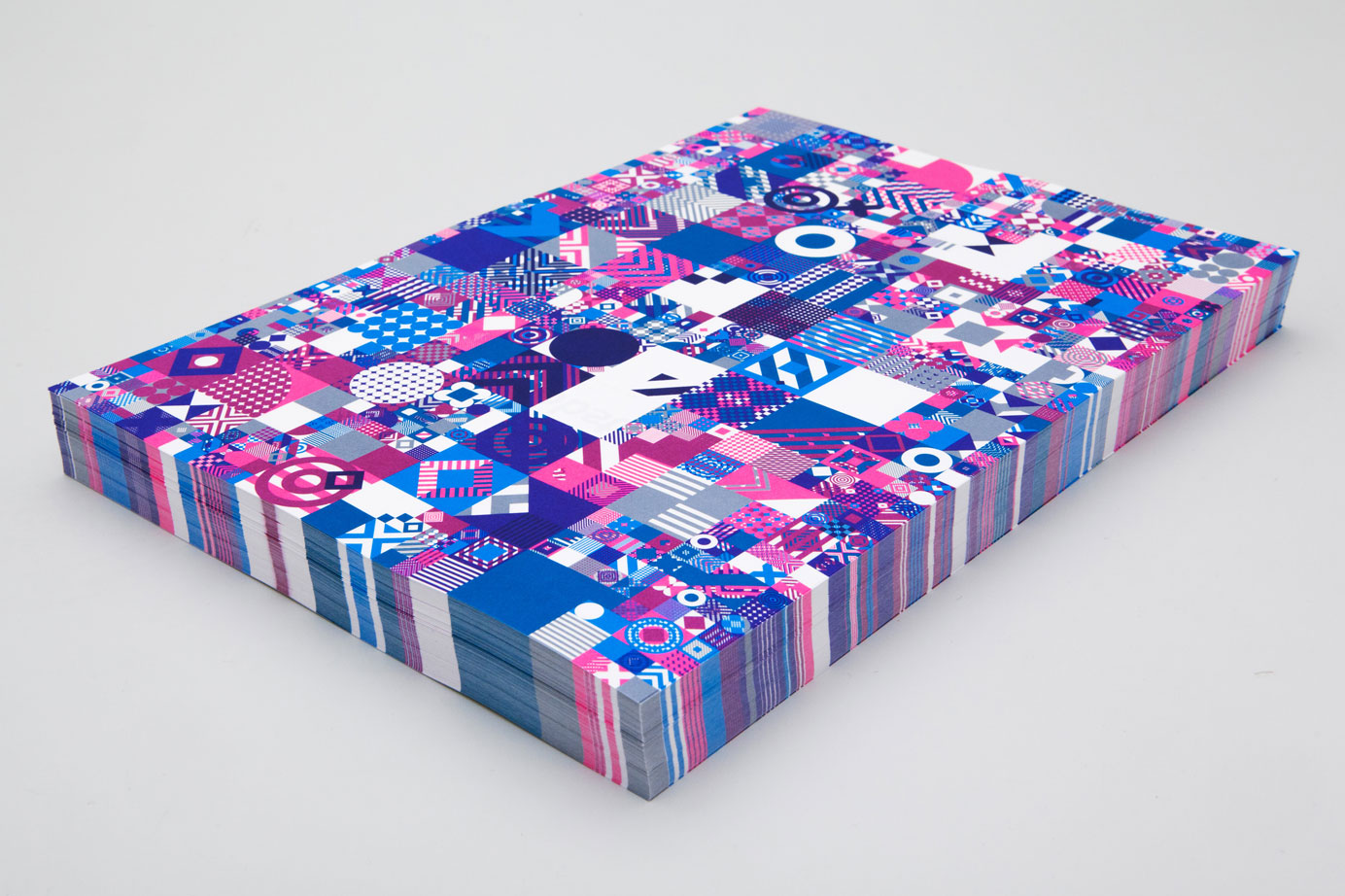
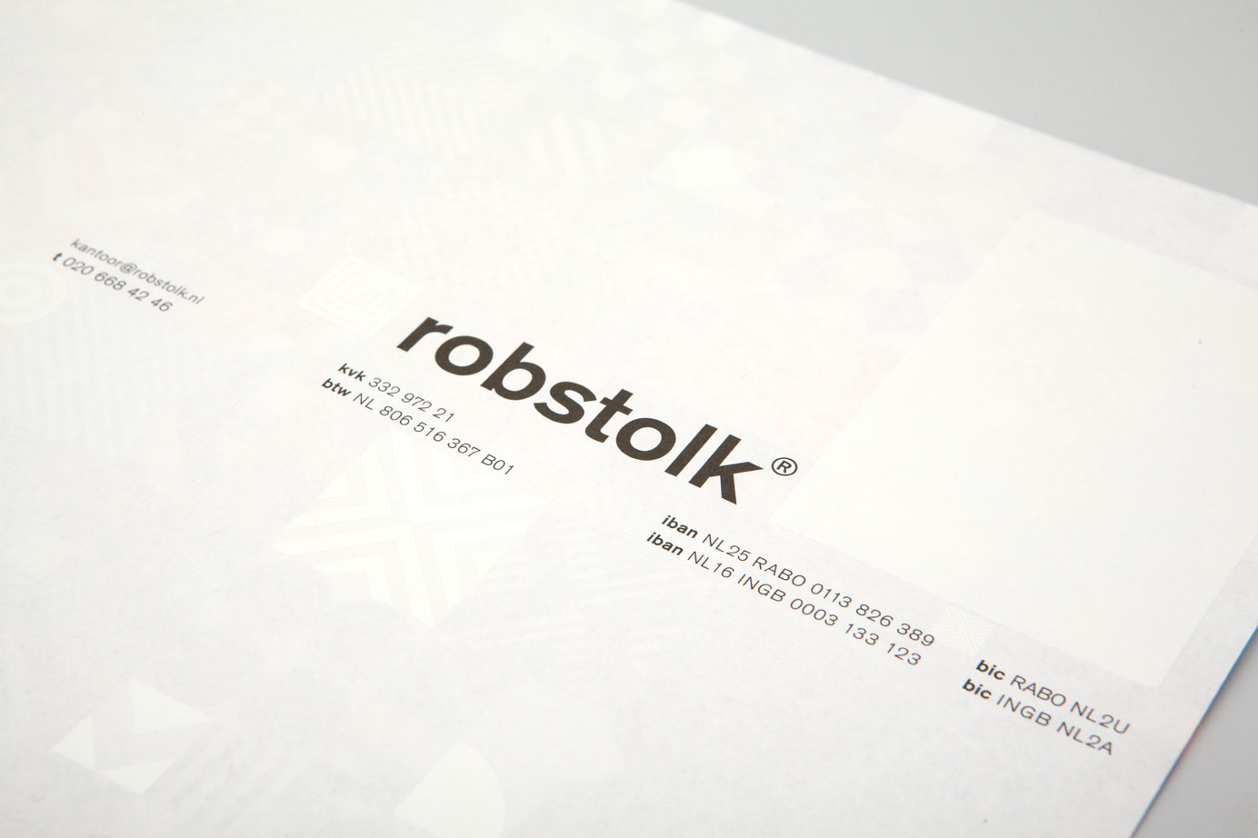
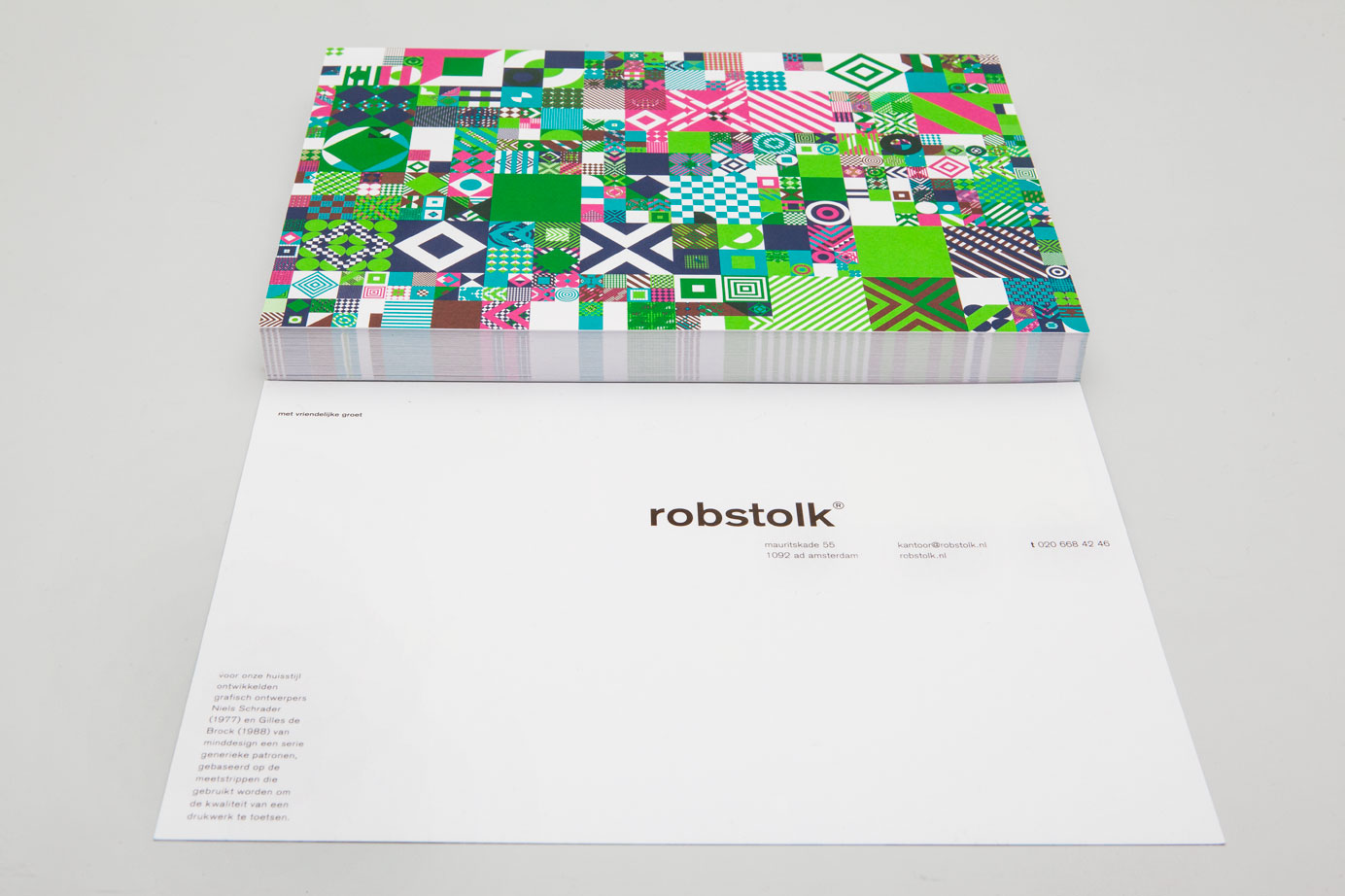
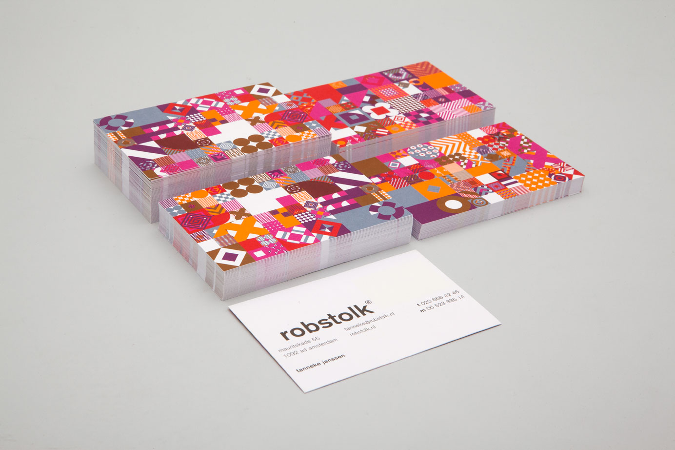
This stationery is the 2014 sequel to the visual identity for first class printing company Robstolk. Starting point was to include into the design elements which would showcase the quality standards of the printer. Hence, the implementation of color control bars and the challenging overprint technique.
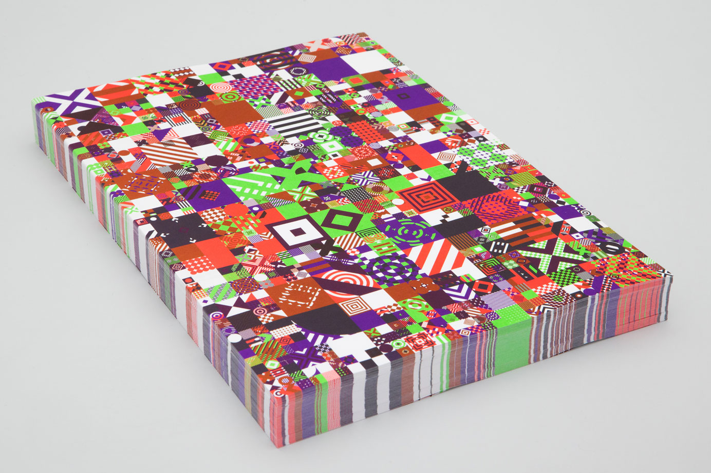
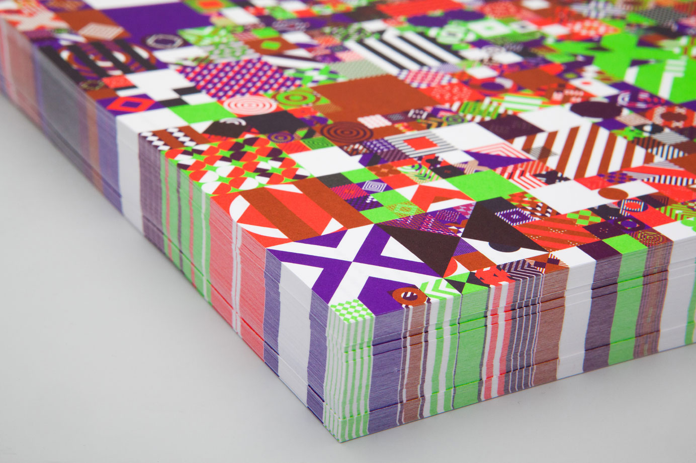
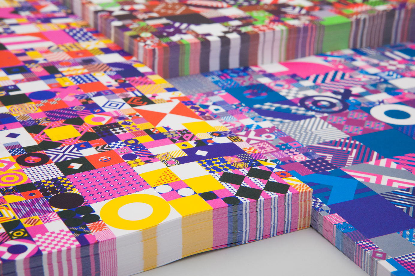
The result is a kaleidoscopic pattern created by a computer algorithm that assembles a number of shapes and colors into a grid of unique cells with various sizes. All the individual shapes and styles derive from numerous medieval shield patterns and were carefully adapted to match the scaling. With its deeply saturated colors, the overprint process brings to life a wide range of media including letterhead, business card and wrapping paper.
Learn more about the identity on Dutch Design Daily.
design in collaboration with: Gilles de Brock; printing: Robstolk